
Studies have shown that nutrition and essential oils, when applied topically, ingested, or inhaled, can have a powerful effect on mood, performance and recovery. Colorado Apothecary provides a line of essential oils, balms, and protein powders that are formulated for elite athletes and fitness enthusiasts. The all-natural products can be used before, during, and after workouts and competitions to improve athletic performance and speed recovery.
Research
Concept & Naming
Logo & Branding
Packaging
Copywriting
UI & Content Development
Pen & Pencil
Illustrator
Photoshop
XD
Framer


Research for Colorado Apothecary was conducted by reading medical studies as well as articles on mysticism and sacred geometry. Additional research included analyzing key competitors and establishing a target market and target audience, including demographics, psychographics and geographics. The design process included mind mapping, identifying tone words, creating mood boards, and analog and digital sketching.
Colorado Apothecary customers are elite athletes and fitness enthusiasts that love being outside, lead health conscious lifestyles, and invest in high-end athletic gear. They are highly competitive, track performance indicators, and are willing to try the latest trend in order to improve performance. They value unique experiences, authenticity, corporate responsibility (especially environmentalism), and content that will help them reach their goals.
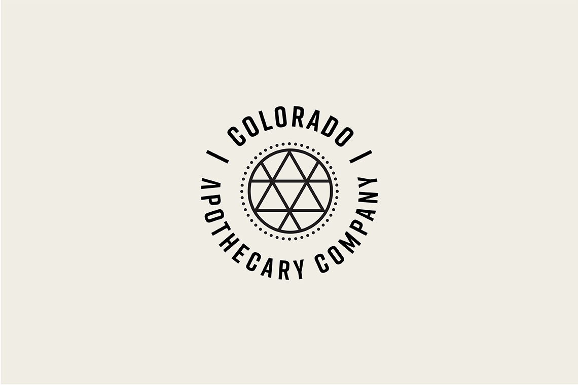

The Colorado Apothecary logo is a subtle reference to the state's mountains and a visual representation of the journey that elite athletes are on as they strive for peak performance. The bold, straight lines of Rift Bold create a sense of trust, cleanliness, and precision, all of which are necessary for a brand selling products that are specifically formulated, meant to be consumed, and used on the body. The icon in the center of the badge can be replaced to indicate the sport or activity for which the product is intended.
Icons for Colorado Apothecary were inspired by the shapes, patterns, and proportions found in sacred geometry, the mathematical constants found in nature, science, and the human body that are believed to show the interconnectedness of all things. Each sport is represented by a geometric shape, representing the connection between nature, movement, and the human body. The icons reflect the brand's belief that humans are deeply connected to the Earth and have a responsiblity to care for it.
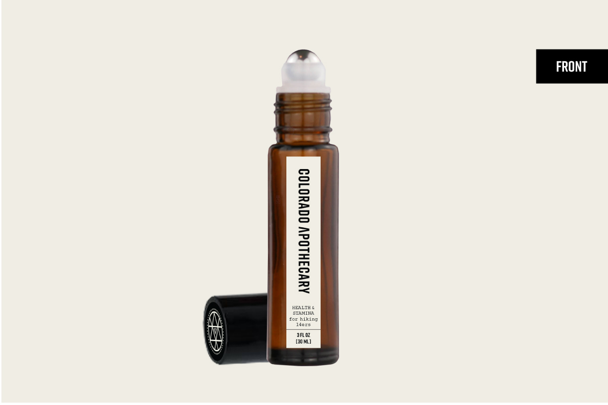
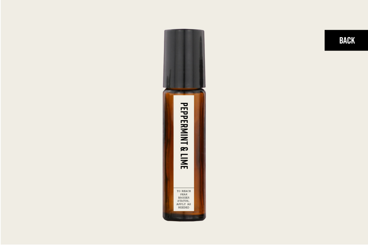
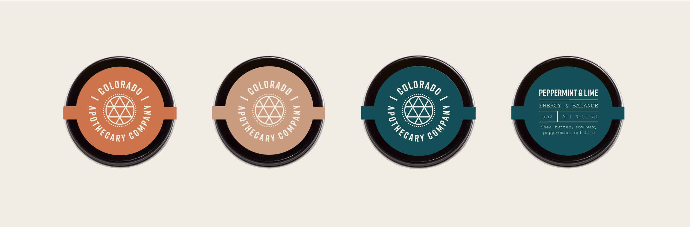

Packaging for the Colorado Apothecary was designed with busy athletes in mind. All items are light weight, durable, and easy to transport in a gym bag, backpack or pocket. Amber bottles and metal tins protect and prolong the life of the essential oils, balms and protein powders, which can be damanged by exposure to light and extreme heat.
Colorado Apothecary is committed to protecting the environment. Product labels and marketing materials are printed with soy ink on 100% postconsumer waste recycled paper. All packaging is reusable, recyclable, and designed to produce minimal waste. Containers can be returned to the store for reuse and a $1.00 discount on the customer's next purchase.

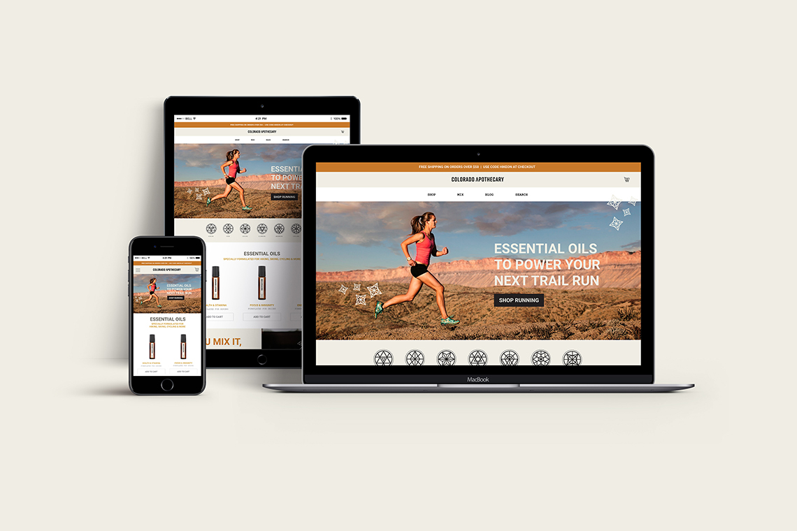


The Colorado Apothecary website is an extension of the company's branding--clean and minimal with mystic details. A mega navigation allows products to be filtered by activity or end result, breadcrumbs ensure customers don't get lost while browsing, and large buttons create a smooth navigation and checkout experience. Photos, headlines and content were developed with the company's target audience in mind, appealing to their desire to meet performance goals, have unique experiences, and their love of the outdoors.
The Colorado Apothecary shopping experience transforms seamlessly from the physical store to the online store and from desktop to mobile, providing a consistent online experience for the company's on-the-go customer base. The website was designed on a fluid twelve column grid that allows for quick and easy resizing across multiple screens as well as increases search rankings, mobile traffic, and time spent on site.
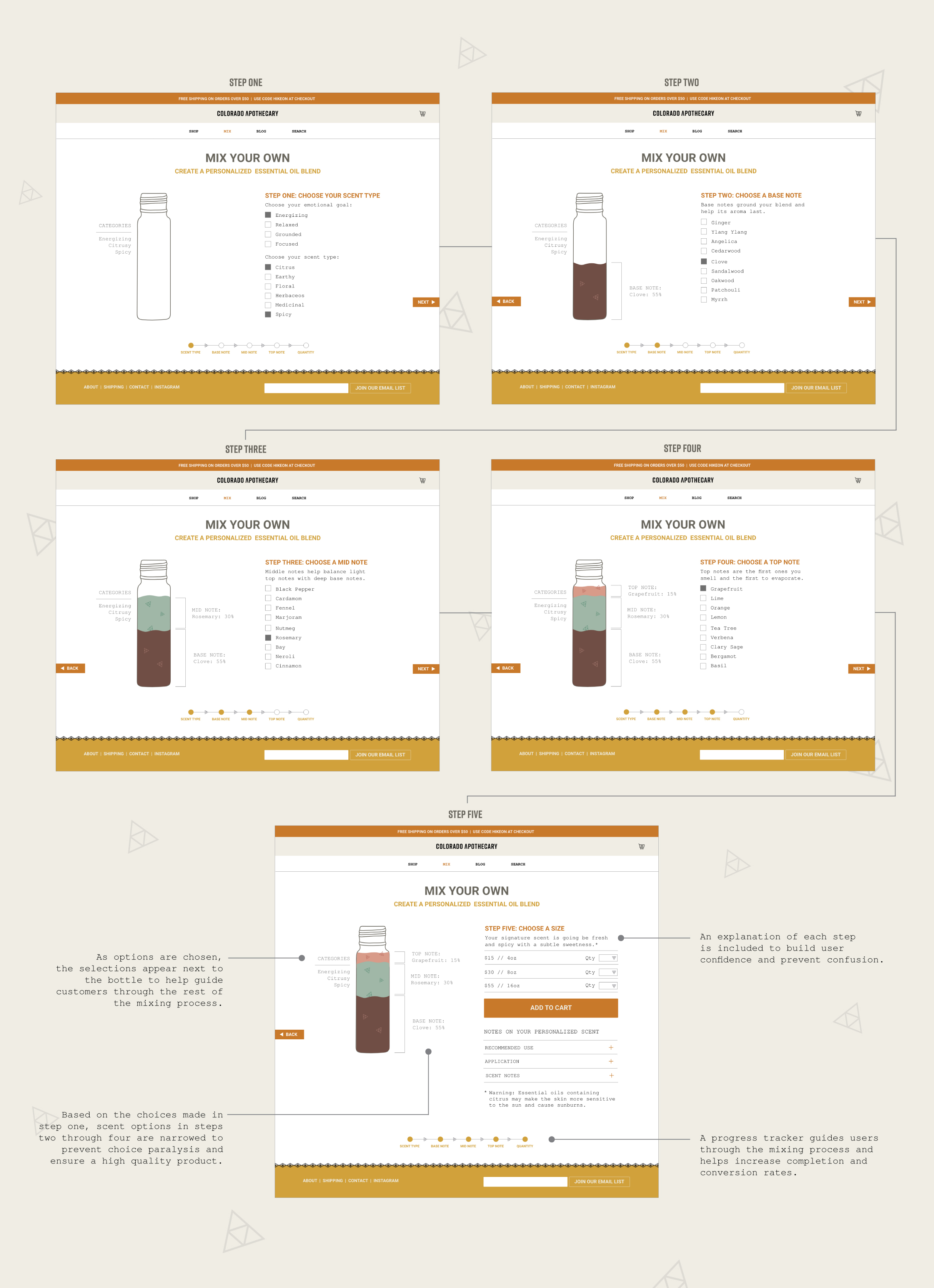
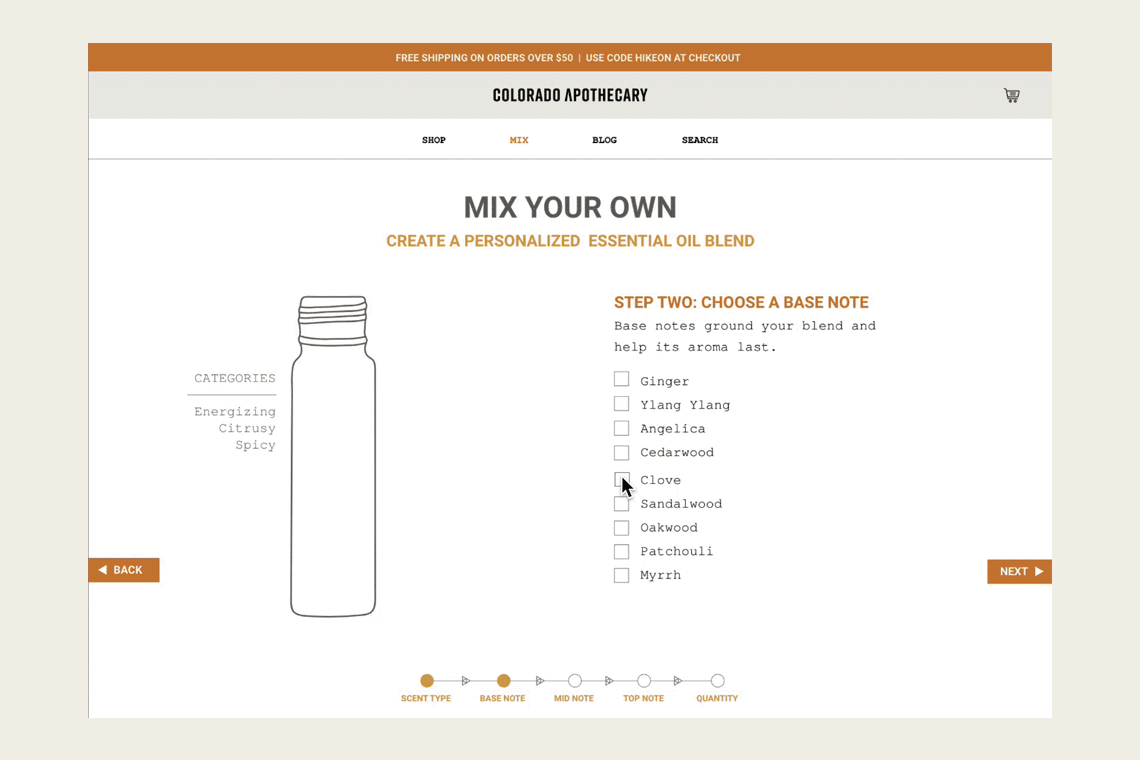

Knowing that Colorado Apothecary's customers appreciate unique experiences, the company offers personalized essential oil blends in store and online. The online ordering process mirrors the in-store experience of working with a store employee, offering customers guidance and suggestions throughout the process. The seamless shopping experience and microanimations surprise and delight shoppers, inspiring them to try different oil combinations, complete the mixing process, and bring them back for repeat purchases.
Each step of the online essential oil mixing process includes short explanations to help build user confidence and prevent confusion. A progress tracker ensures the user knows what step they are on, what's coming next, and how close they are to completing the process. The scent notes chosen in step one narrow the options displayed in future steps to prevent choice paralysis and chosen scents are displayed next to the bottle to help guide future decisions.